Card

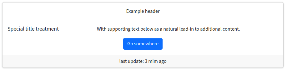
Bootstrap’s cards provide a flexible and extensible content container with multiple variants and options.

Bootstrap docs: https://getbootstrap.com/docs/5.3/components/card/

Card

Syntax

$Bootstrap = new renderabootstrap5component();
echo $Bootstrap->card($aOptions)
Returns: string

Parameters: 1

Parameter #0 [ <required> array $aOptions ] 
array of card item

Output:

  • header {string} optional: header; default: null (no header bar)

  • image {string} optional: image url for image on top of the body

  • title {string} optional: title in body of the card

  • subtitle {string} optional: title2 in body of the card

  • text {string} optional: bodytext of the card (on top of “body”)

  • list {array} optional: array of list items (on top of “body”)

  • body {string} optional: free html code of the card

  • footer {string} optional: footer bar; default: null (no footer)

Styling:

  • class {string} additional classses for card wrapper div; eg. “text-center” to center the content

Example

PHP snippet

$Bootstrap->card([
  'body' => '<p>Hello!<br><a href="#">Link</a></p>',
]);

Generated html output

<div class="card">
<div class="card-body">
<p>
Hello!
<br>
<a href="#">
Link
</a>
</p>
</div>
</div>