Table of Contents
Input
Draw an input field and a label with horizontal direction.
Syntax
$renderAdminLTE->getFormInput($aOptions);
Return
{string} html code
Parameters
- $aOptions - {array} options to describe the element
Styling:
| Key | Description |
|---|---|
| class | optional: additional css classes |
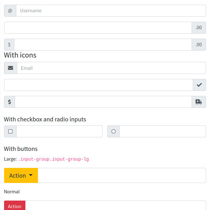
| append | optional: content on input start |
| prepend | optional: content on input end |
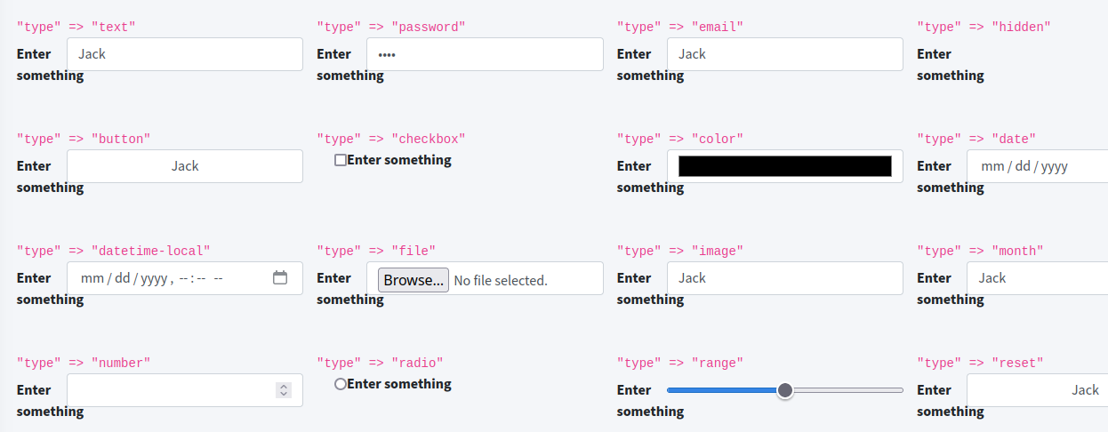
| type | field type: text, email, password, hidden and all other html 5 input types |
Content:
| Key | Description |
|---|---|
| hint | optional: Hint text above form field |
| label | label in front of the input element |
| name | name attribute for sending form data |
| value | value of the input field/ visible text; for checkbox and radio: the data to send when sending a form |
Examples
Simple text input field
$renderAdminLTE->getFormInput([
  'label' => 'Enter firstname',
  'type' => 'text',
  'name' => 'firstname',
  'value' => '',
]);
You get a label, an input field wrapped in a <div class="form-group row">.
<div class="form-group row">
  <label for="firstname-27ece2891a0275dd604732b681fc666f" class="col-sm-2 col-form-label">
    Enter firstname
  </label>
  <div class="col-sm-10">
    <input  type="text" class="form-control myclass" name="firstname" value="" id="firstname-27ece2891a0275dd604732b681fc666f"/>
  </div>
</div>
Text input with append/ prepend
With using append and prepend keys you can create gray boxes on left and right. Add a character, an icon or html code for the addon content.
Radio and checkboxes
For these input types you can use multiple elements.
You must wrap a bunch of input elements into <div class="form-group row"> “manually”.
echo '<div class="form-group">'
  . $renderAdminLTE->getFormInput([
      'type' => 'checkbox',
      'label' => 'first option',
      'name' => 'first',
      'value' => 'yes',
    ])
  . $renderAdminLTE->getFormInput([
      'type' => 'checkbox',
      'label' => 'second option',
      'name' => 'second',
      'value' => 'yes',
    ])
  .'</div>'
  ;
Simple range slider
A simple slider:
$renderAdminLTE->getFormInput([
  'tag' => 'input',
  'type' => 'range', // <-----------
  'min' => 0,
  'max' => 3,
  'step' => 1,
  'label' => 'Select 0..6',
]);
Range with labels
To add labels you need a datalist for the values and the labels to show, eg
<datalist id="datalist-range">
  <option value="0" label="no risc"></option>
  <option value="1" label="1"></option>
  <option value="2" label="2"></option>
  <option value="3" label="medium"></option>
  <option value="4" label="4"></option>
  <option value="5" label="5"></option>
  <option value="6" label="critical"></option>
</datalist>
The id you ned to reference in the key “datalist”:
$renderAdminLTE->getFormInput([
  'tag' => 'input',
  'type' => 'range',
  'min' => 0,
  'max' => 6,
  'step' => 1,
  'label' => 'Select 0..6',
  'datalist' => 'datalist-range', // <-----------
]);
For the datalist you need to extend your css:
datalist {
  display: flex;
  flex-direction: column;
  justify-content: space-between;
  writing-mode: vertical-lr;
  width: 100%;
}