Table of Contents
Card
A div to display boxed content.
It has header, main text and a footer.
Syntax
$renderAdminLTE->getCard($aOptions);
Return
{string} html code
Parameters
- $aOptions - {array} options to describe the element
Styling:
| Key | Description |
|---|---|
| class | optional: additional css classes |
| shadow | size of shadow; one of - [empty] (=default: none) - “none” - “regular” - “large” |
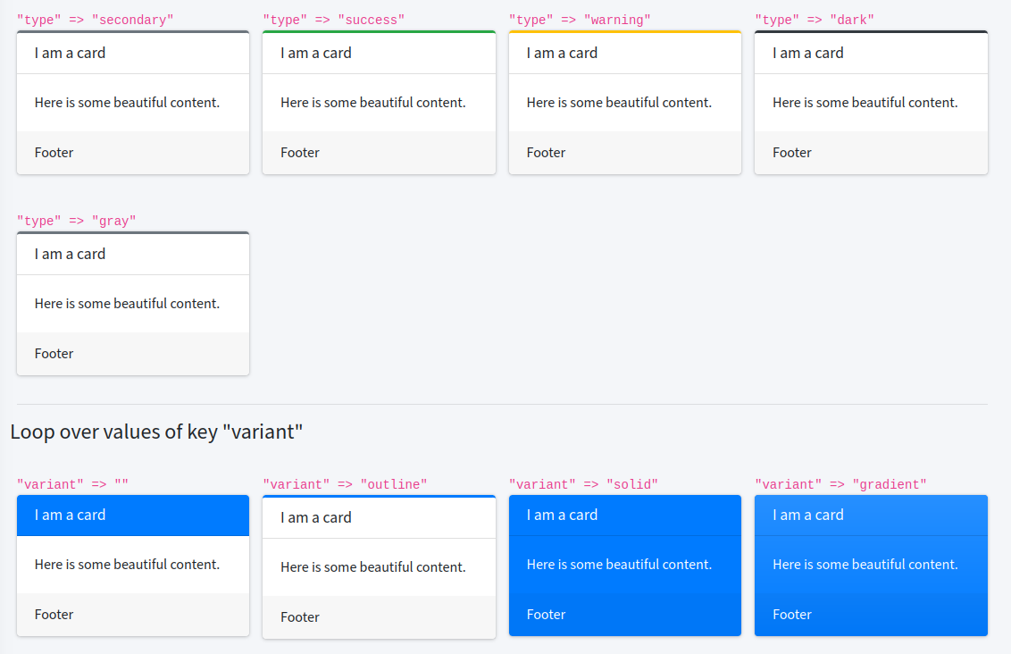
| type | one of - [empty] - “danger” - “info” - “primary” - “secondary” - “success” - “warning” - “dark” - “gray” - “light” |
| variant | kind of coloring: one of - “default” - titlebar is colored - “outline” - a small stripe on top border is colored - “solid” - whole card is colored - “gradient” - whole card is colored with a gradient |
| state | window state. one of [none]|collapsed|maximized |
Remark: in v4
- default shadow is none now
- “small” was removed.
Toolbar icons:
Set to true to show it; default: none of it is visible
| Key | Description |
|---|---|
| tb-collapse | show minus icon to collapse widget |
| tb-expand | show plus button to expand; it is added automatically if you set ‘state’=>‘collapsed’ |
| tb-maximize | show maximize button |
| tb-minimize | show minimize button; it is added automatically if you set ‘state’=>‘maximized’ |
Remark: in v4 “tb-remove” was removed.
Content:
| Key | Description |
|---|---|
| footer | footer of the card |
| text | visible text |
| title | title of the card |
| tools | html code for upper right corner |
Example
$renderAdminLTE->getCard(array (
  'type' => 'primary',
  'variant' => 'solid',
  'tb-remove' => 1,
  'tb-collapse' => 1,
  'title' => 'I am a card',
  'tools' => '123',
  'text' => 'Hello everybody out there!',
  'footer' => '© Axel',
));